In the fast-paced world of web design, captivating user attention and engagement is paramount. One effective way to achieve this is through dynamic animations that not only enhance the visual appeal of a website but also provide interactive feedback to users. In this in-depth tutorial, we'll delve into the electrifying realm of spark voltage button animations using HTML and CSS. Learn how to add a spark of excitement to your website with this dynamic effect that will captivate and delight your visitors.
Today's Video Link: Tap here!!
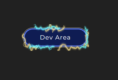
Understanding Spark Voltage Button Animation
The spark voltage button animation is a dynamic effect that simulates the generation of sparks and voltage fluctuations within a button element on a webpage. This effect adds a sense of energy and excitement to the user interface, making the act of clicking a button feel more engaging and interactive. Whether used on a gaming website, a tech blog, or an e-commerce platform, the spark voltage button animation is sure to leave a lasting impression on users and elevate the overall user experience.
Getting Started with HTML/CSS
To create the spark voltage button animation, we'll harness the power of HTML and CSS, the foundational technologies of web design. HTML will be used to structure the button element, while CSS will be employed to apply styling and animation effects. The process is relatively straightforward and accessible to web designers of all skill levels, from beginners to seasoned professionals.
Step-by-Step Tutorial
HTML Structure: Begin by defining the button element within the HTML markup. This may include specifying the button's text content, size, and positioning within the webpage.
CSS Styling: Apply CSS styling to the button element to define its appearance, including colors, borders, and shadows. Additionally, apply CSS properties to create the desired animation effects, such as transitions, transforms, and keyframe animations.
Animating the Spark: Implement animation effects to simulate the generation of sparks within the button element. This may involve creating a series of animated particles or using CSS animations to generate spark-like effects.
Animating the Voltage Fluctuations: Add animation effects to simulate voltage fluctuations within the button element. This could involve animating the button's background color, opacity, or border properties to create a pulsating effect reminiscent of electrical activity.
Testing and Optimization: Once the spark voltage button animation is implemented, thoroughly test it across different browsers and devices to ensure compatibility and responsiveness. Make any necessary adjustments to optimize the animation for a seamless user experience.
HTML Code:
<div class="voltage-button">
<button>Dev Area</button>
<svg version="1.1" xmlns="http://www.w3.org/2000/svg" x="0px" y="0px" viewBox="0 0 234.6 61.3" preserveAspectRatio="none" xml:space="preserve">
<filter id="glow">
<feGaussianBlur class="blur" result="coloredBlur" stdDeviation="2"></feGaussianBlur>
<feTurbulence type="fractalNoise" baseFrequency="0.075" numOctaves="0.3" result="turbulence"></feTurbulence>
<feDisplacementMap in="SourceGraphic" in2="turbulence" scale="30" xChannelSelector="R" yChannelSelector="G" result="displace"></feDisplacementMap>
<feMerge>
<feMergeNode in="coloredBlur"></feMergeNode>
<feMergeNode in="coloredBlur"></feMergeNode>
<feMergeNode in="coloredBlur"></feMergeNode>
<feMergeNode in="displace"></feMergeNode>
<feMergeNode in="SourceGraphic"></feMergeNode>
</feMerge>
</filter>
<path class="voltage line-1" d="m216.3 51.2c-3.7 0-3.7-1.1-7.3-1.1-3.7 0-3.7 6.8-7.3 6.8-3.7 0-3.7-4.6-7.3-4.6-3.7 0-3.7 3.6-7.3 3.6-3.7 0-3.7-0.9-7.3-0.9-3.7 0-3.7-2.7-7.3-2.7-3.7 0-3.7 7.8-7.3 7.8-3.7 0-3.7-4.9-7.3-4.9-3.7 0-3.7-7.8-7.3-7.8-3.7 0-3.7-1.1-7.3-1.1-3.7 0-3.7 3.1-7.3 3.1-3.7 0-3.7 10.9-7.3 10.9-3.7 0-3.7-12.5-7.3-12.5-3.7 0-3.7 4.6-7.3 4.6-3.7 0-3.7 4.5-7.3 4.5-3.7 0-3.7 3.6-7.3 3.6-3.7 0-3.7-10-7.3-10-3.7 0-3.7-0.4-7.3-0.4-3.7 0-3.7 2.3-7.3 2.3-3.7 0-3.7 7.1-7.3 7.1-3.7 0-3.7-11.2-7.3-11.2-3.7 0-3.7 3.5-7.3 3.5-3.7 0-3.7 3.6-7.3 3.6-3.7 0-3.7-2.9-7.3-2.9-3.7 0-3.7 8.4-7.3 8.4-3.7 0-3.7-14.6-7.3-14.6-3.7 0-3.7 5.8-7.3 5.8-2.2 0-3.8-0.4-5.5-1.5-1.8-1.1-1.8-2.9-2.9-4.8-1-1.8 1.9-2.7 1.9-4.8 0-3.4-2.1-3.4-2.1-6.8s-9.9-3.4-9.9-6.8 8-3.4 8-6.8c0-2.2 2.1-2.4 3.1-4.2 1.1-1.8 0.2-3.9 2-5 1.8-1 3.1-7.9 5.3-7.9 3.7 0 3.7 0.9 7.3 0.9 3.7 0 3.7 6.7 7.3 6.7 3.7 0 3.7-1.8 7.3-1.8 3.7 0 3.7-0.6 7.3-0.6 3.7 0 3.7-7.8 7.3-7.8h7.3c3.7 0 3.7 4.7 7.3 4.7 3.7 0 3.7-1.1 7.3-1.1 3.7 0 3.7 11.6 7.3 11.6 3.7 0 3.7-2.6 7.3-2.6 3.7 0 3.7-12.9 7.3-12.9 3.7 0 3.7 10.9 7.3 10.9 3.7 0 3.7 1.3 7.3 1.3 3.7 0 3.7-8.7 7.3-8.7 3.7 0 3.7 11.5 7.3 11.5 3.7 0 3.7-1.4 7.3-1.4 3.7 0 3.7-2.6 7.3-2.6 3.7 0 3.7-5.8 7.3-5.8 3.7 0 3.7-1.3 7.3-1.3 3.7 0 3.7 6.6 7.3 6.6s3.7-9.3 7.3-9.3c3.7 0 3.7 0.2 7.3 0.2 3.7 0 3.7 8.5 7.3 8.5 3.7 0 3.7 0.2 7.3 0.2 3.7 0 3.7-1.5 7.3-1.5 3.7 0 3.7 1.6 7.3 1.6s3.7-5.1 7.3-5.1c2.2 0 0.6 9.6 2.4 10.7s4.1-2 5.1-0.1c1 1.8 10.3 2.2 10.3 4.3 0 3.4-10.7 3.4-10.7 6.8s1.2 3.4 1.2 6.8 1.9 3.4 1.9 6.8c0 2.2 7.2 7.7 6.2 9.5-1.1 1.8-12.3-6.5-14.1-5.5-1.7 0.9-0.1 6.2-2.2 6.2z" fill="transparent" stroke="#fff"></path>
<path class="voltage line-2" d="m216.3 52.1c-3 0-3-0.5-6-0.5s-3 3-6 3-3-2-6-2-3 1.6-6 1.6-3-0.4-6-0.4-3-1.2-6-1.2-3 3.4-6 3.4-3-2.2-6-2.2-3-3.4-6-3.4-3-0.5-6-0.5-3 1.4-6 1.4-3 4.8-6 4.8-3-5.5-6-5.5-3 2-6 2-3 2-6 2-3 1.6-6 1.6-3-4.4-6-4.4-3-0.2-6-0.2-3 1-6 1-3 3.1-6 3.1-3-4.9-6-4.9-3 1.5-6 1.5-3 1.6-6 1.6-3-1.3-6-1.3-3 3.7-6 3.7-3-6.4-6-6.4-3 2.5-6 2.5h-6c-3 0-3-0.6-6-0.6s-3-1.4-6-1.4-3 0.9-6 0.9-3 4.3-6 4.3-3-3.5-6-3.5c-2.2 0-3.4-1.3-5.2-2.3-1.8-1.1-3.6-1.5-4.6-3.3s-4.4-3.5-4.4-5.7c0-3.4 0.4-3.4 0.4-6.8s2.9-3.4 2.9-6.8-0.8-3.4-0.8-6.8c0-2.2 0.3-4.2 1.3-5.9 1.1-1.8 0.8-6.2 2.6-7.3 1.8-1 5.5-2 7.7-2 3 0 3 2 6 2s3-0.5 6-0.5 3 5.1 6 5.1 3-1.1 6-1.1 3-5.6 6-5.6 3 4.8 6 4.8 3 0.6 6 0.6 3-3.8 6-3.8 3 5.1 6 5.1 3-0.6 6-0.6 3-1.2 6-1.2 3-2.6 6-2.6 3-0.6 6-0.6 3 2.9 6 2.9 3-4.1 6-4.1 3 0.1 6 0.1 3 3.7 6 3.7 3 0.1 6 0.1 3-0.6 6-0.6 3 0.7 6 0.7 3-2.2 6-2.2 3 4.4 6 4.4 3-1.7 6-1.7 3-4 6-4 3 4.7 6 4.7 3-0.5 6-0.5 3-0.8 6-0.8 3-3.8 6-3.8 3 6.3 6 6.3 3-4.8 6-4.8 3 1.9 6 1.9 3-1.9 6-1.9 3 1.3 6 1.3c2.2 0 5-0.5 6.7 0.5 1.8 1.1 2.4 4 3.5 5.8 1 1.8 0.3 3.7 0.3 5.9 0 3.4 3.4 3.4 3.4 6.8s-3.3 3.4-3.3 6.8 4 3.4 4 6.8c0 2.2-6 2.7-7 4.4-1.1 1.8 1.1 6.7-0.7 7.7-1.6 0.8-4.7-1.1-6.8-1.1z" fill="transparent" stroke="#fff"></path>
</svg>
<div class="dots">
<div class="dot dot-1"></div>
<div class="dot dot-2"></div>
<div class="dot dot-3"></div>
<div class="dot dot-4"></div>
<div class="dot dot-5"></div>
</div>
</div>
CSS Code:
.voltage-button {
position: relative;
}
.voltage-button button {
color: white;
background: #0D1127;
padding: 1rem 3rem 1rem 3rem;
border-radius: 5rem;
border: 5px solid #5978F3;
font-size: 1.2rem;
line-height: 1em;
letter-spacing: 0.075em;
transition: background 0.3s;
}
.voltage-button button:hover {
cursor: pointer;
background: #0F1C53;
}
.voltage-button button:hover + svg, .voltage-button button:hover + svg + .dots {
opacity: 1;
}
.voltage-button svg {
display: block;
position: absolute;
top: -0.75em;
left: -0.25em;
width: calc(100% + 0.5em);
height: calc(100% + 1.5em);
pointer-events: none;
opacity: 0;
transition: opacity 0.4s;
transition-delay: 0.1s;
}
.voltage-button svg path {
stroke-dasharray: 100;
filter: url("#glow");
}
.voltage-button svg path.line-1 {
stroke: #f6de8d;
stroke-dashoffset: 0;
animation: spark-1 3s linear infinite;
}
.voltage-button svg path.line-2 {
stroke: #6bfeff;
stroke-dashoffset: 500;
animation: spark-2 3s linear infinite;
}
.voltage-button .dots {
opacity: 0;
transition: opacity 0.3s;
transition-delay: 0.4s;
}
.voltage-button .dots .dot {
width: 1rem;
height: 1rem;
background: white;
border-radius: 100%;
position: absolute;
opacity: 0;
}
.voltage-button .dots .dot-1 {
top: 0;
left: 20%;
animation: fly-up 3s linear infinite;
}
.voltage-button .dots .dot-2 {
top: 0;
left: 55%;
animation: fly-up 3s linear infinite;
animation-delay: 0.5s;
}
.voltage-button .dots .dot-3 {
top: 0;
left: 80%;
animation: fly-up 3s linear infinite;
animation-delay: 1s;
}
.voltage-button .dots .dot-4 {
bottom: 0;
left: 30%;
animation: fly-down 3s linear infinite;
animation-delay: 2.5s;
}
.voltage-button .dots .dot-5 {
bottom: 0;
left: 65%;
animation: fly-down 3s linear infinite;
animation-delay: 1.5s;
}
@keyframes spark-1 {
to {
stroke-dashoffset: -1000;
}
}
@keyframes spark-2 {
to {
stroke-dashoffset: -500;
}
}
@keyframes fly-up {
0% {
opacity: 0;
transform: translateY(0) scale(0.2);
}
5% {
opacity: 1;
transform: translateY(-1.5rem) scale(0.4);
}
10%, 100% {
opacity: 0;
transform: translateY(-3rem) scale(0.2);
}
}
@keyframes fly-down {
0% {
opacity: 0;
transform: translateY(0) scale(0.2);
}
5% {
opacity: 1;
transform: translateY(1.5rem) scale(0.4);
}
10%, 100% {
opacity: 0;
transform: translateY(3rem) scale(0.2);
}
}
Conclusion
In just a few simple steps, you've learned how to create a captivating spark voltage button animation using HTML and CSS. Whether you're looking to add a touch of excitement to your website or enhance the interactivity of your user interface, mastering this animation technique opens up a world of creative possibilities for your web design projects. Experiment with different styles, colors, and animation techniques to create unique and visually stunning effects that will captivate your audience. Subscribe to our channel for more tutorials and tips on web design, and let's continue to push the boundaries of creativity together!
Now that you've mastered the spark voltage button animation, it's time to unleash your creativity and incorporate this electrifying effect into your web projects. Whether you're designing a gaming website, a tech blog, or an e-commerce platform, the spark voltage button animation is sure to leave a lasting impression on users and elevate the overall user experience. Let's ignite interactivity in web design and spark engagement with this dynamic effect!


0 Comments